
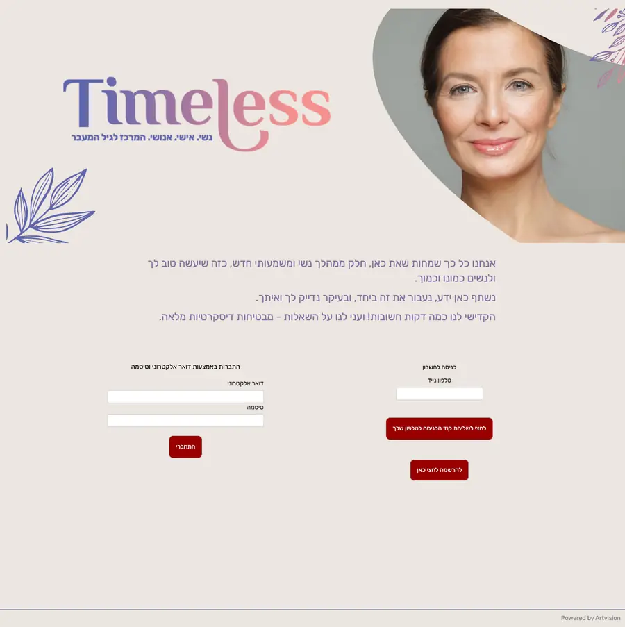
Site for a menopause centre for women
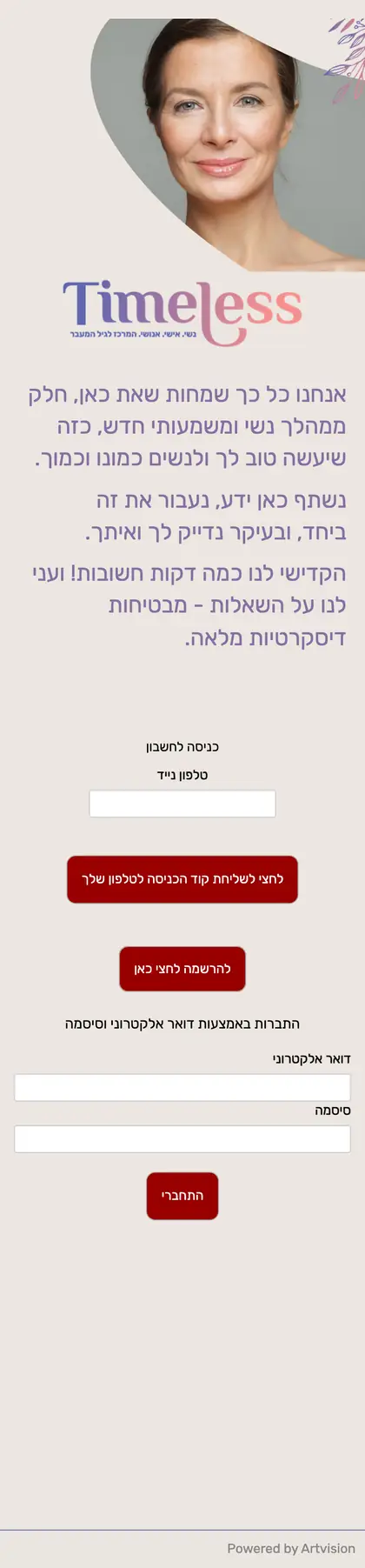
Hebrew, laid out to read right to left
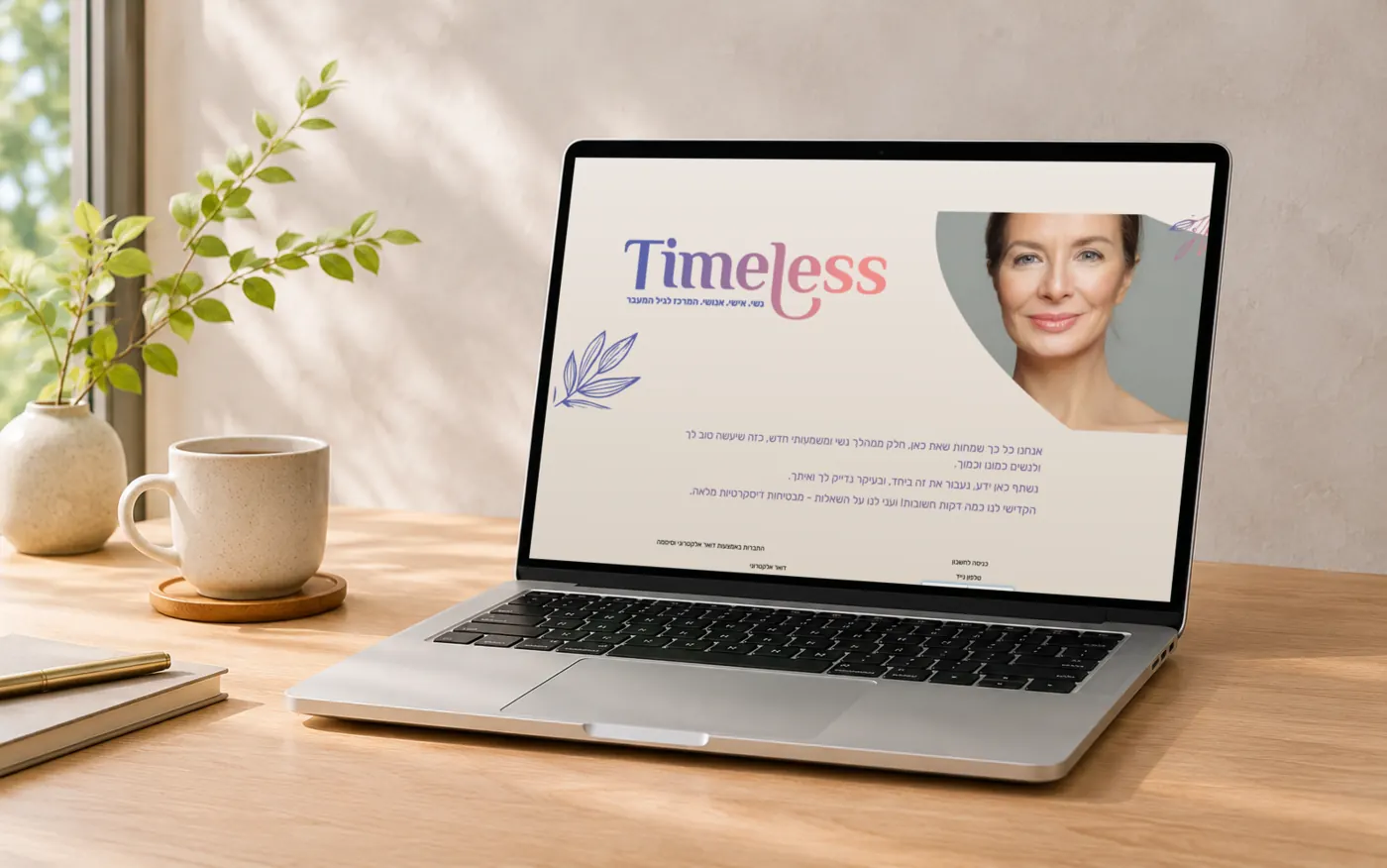
Shown on a laptop (composite; the screen is the real site)
ChallengeChallenge
To present the subject of menopause with calm colours and an easy-to-read layout.
IdeaIdea
A calm beige paired with the logo’s lavender-to-pink gradient. To suit Hebrew, the whole page is laid out to read from right to left.
DeliverablesDeliverables
- Website (desktop and smartphone)
PaletteColour
Beige
#ECE6E2Blush
#D9A996Terracotta
#BD9073Adzuki
#7D5B5AGrey
#AAA7A9Colours sampled from the screen.
CreditsCredits
- Type
- Website
- Design
- Persiss
- URL
- time-less.life ↗
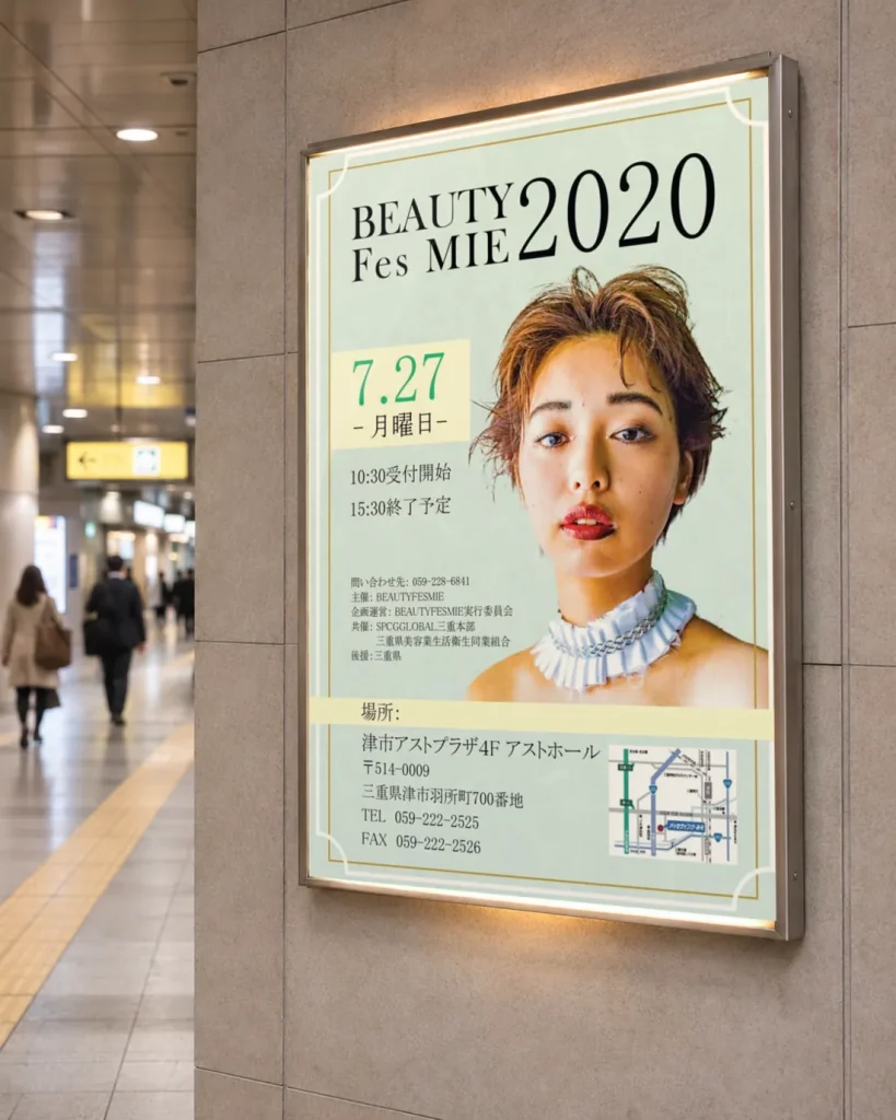
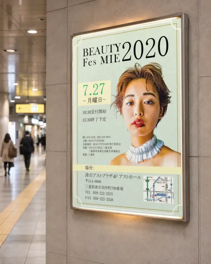
A beauty event in Mie Prefecture
Next case study
Contact
Let’s shape what’s best —
Let’s shape what’s best —
together.
Even a rough idea is a great start. 日本語でもお気軽にどうぞ。
info@persiss.com