





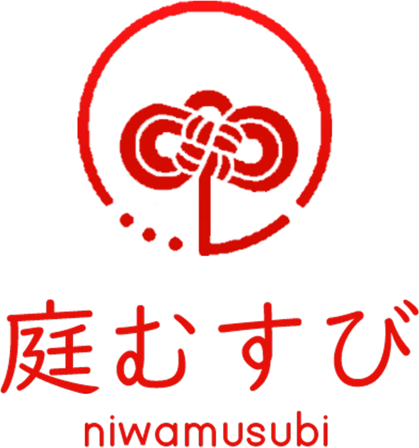
Logo for a Japanese trade name
Knot symbol with Japanese and Latin logotypes
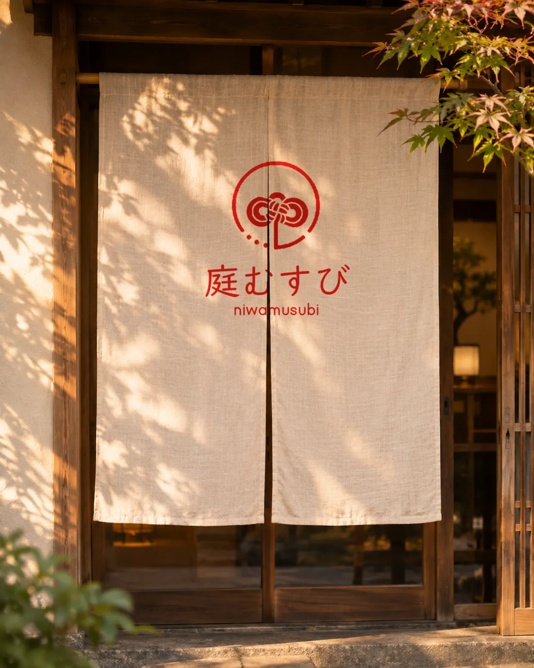
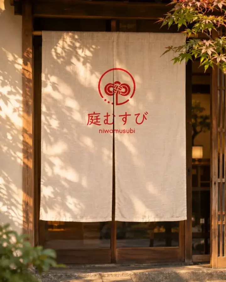
Shown on a noren shop curtain (composite)
To express the “musubi” (tying, binding) in the name as a single knot.
A single knot inside a red circle. The circle breaks slightly at the bottom, and a few small dots let it trail off. Curves that recall a mizuhiki cord knot, a Japanese logotype that keeps the warmth of handwriting, and a rounded Latin face are held together in one vermilion. It keeps its shape reversed out in white, so it works on fabric, wood or paper.
-
Step 1
Building the symbol
Laid over a circle and centre lines, the placement of symbol and lettering becomes visible. The lines are explanatory guides; the logo itself is the original artwork.
-
Step 2
Among other logos
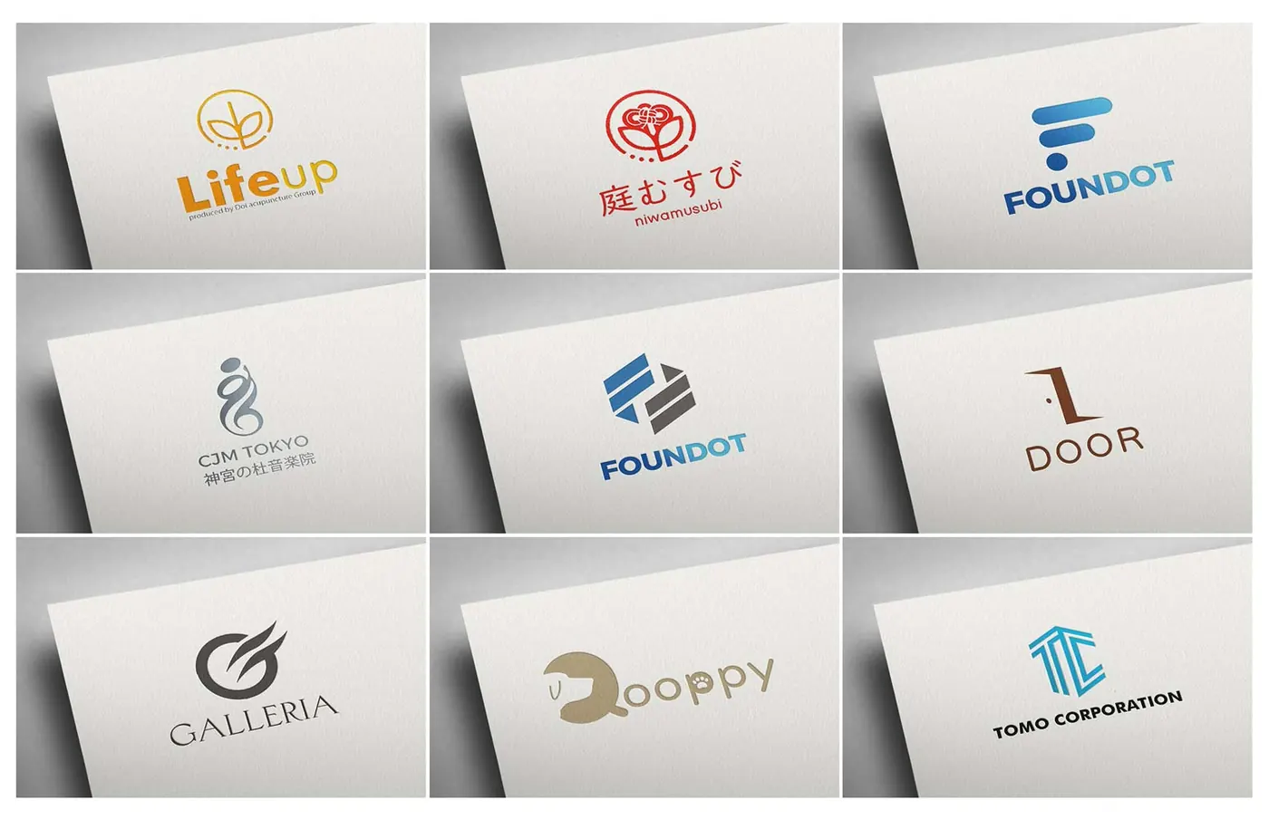
Part of a presentation showing it alongside other logos we have made.
- Symbol
- Japanese logotype
- Latin (romanised) logotype
#E0100A#FFFFFFThe logo uses a single vermilion (sampled from the logo image).
- Type
- Logo design
- Design
- Persiss
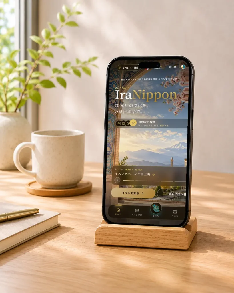
Website for an Iranian cultural centre
Next case studyLet’s shape what’s best —
together.
Even a rough idea is a great start. 日本語でもお気軽にどうぞ。